Thanks to the beauty of the interwebs, I came across this great infographic from Blackbaud about generational giving. Go ahead and take a look – it is so gorgeously designed, contains great data – and hey, the people are moving!
It obviously contains lots of rich data that can be incorporated into fundraising strategies, but there are also a few really interesting takeaways for communicators.
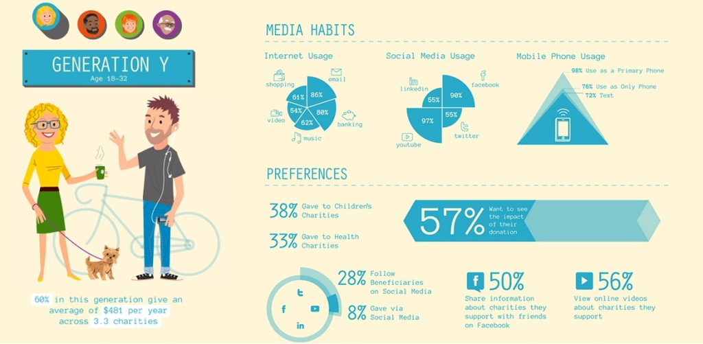
First, the numbers show that a sizeable percentage of the age groups in this analysis gave directly through an organization’s website. This points to the absolutely vital role that user experience plays on a site, and especially on the donate page. A clean, well designed and functional web space should be a priority, for donations, brand recognition and communicating messages.
Second, I was a bit surprised by the prominence of YouTube as a social media channel across multiple age ranges. While expected for the younger age groups, it remained consistent for Generation X and even Baby Boomer populations (92% and 81%, respectively). Also, the analysis shows that a good percentage of groups viewed online videos about charities they support. This solidifies the recommendation that video content and other multimedia assets should be included in communications planning.
Lastly, while not a new idea, the importance of integrated, multi-channel communications remains critical to overall success. And, as this infographic shows, that can still include direct mail!
Take a look for yourself, and let us know if you pick up any other interesting insights from this infographic. We’d love to hear. Let us know below, or tweet us – @DG_Company.